So to show you, my audience, how my coursework is progressing. Below is the 3rd draft of my poster. I still have a lot of work to do on it, however I like the overall idea of it and the way it looks so far :)
Showing posts with label New Blog. Show all posts
Wednesday, 22 October 2014
Coursework: Working Progress
Due to the amount of coursework changes and dedicated time to my other subjects I haven't had a lot of time to post on my blog about a range of different media related topics.
Sunday, 19 October 2014
Genre - Mixed Signals
This is another link post (sorry), so i'm going to make this post short and sweet
( well try to anyway :) )
I know most of my blog posts have a link or reference to the media edusite website , however it gave me lots of information on how to classify my coursework into a genre.
When deciding on the genre I went straight into thinking about my idea. Using this method I confused myself so I went back to stage 1 in the planning process and got into researching different types of genre, to work out which ones are the best suited to my coursework idea.
The link below is a television drama genre , however it give a list of why drama's are classed the way they are.
http://media.edusites.co.uk/article/television-drama-codes-conventions/
From using this link I decided that my idea may have drama, however it wasn't enough for my film idea to be classed in the drama genre.
Although the link didn't help me, I hope you , my readers, do find it useful :)
( well try to anyway :) )
I know most of my blog posts have a link or reference to the media edusite website , however it gave me lots of information on how to classify my coursework into a genre.
When deciding on the genre I went straight into thinking about my idea. Using this method I confused myself so I went back to stage 1 in the planning process and got into researching different types of genre, to work out which ones are the best suited to my coursework idea.
The link below is a television drama genre , however it give a list of why drama's are classed the way they are.
http://media.edusites.co.uk/article/television-drama-codes-conventions/
From using this link I decided that my idea may have drama, however it wasn't enough for my film idea to be classed in the drama genre.
Although the link didn't help me, I hope you , my readers, do find it useful :)
Tuesday, 14 October 2014
Script: Sneaky Peak
Previously Unposted
When I started to think about writing my script I decided to write the whole script out first and then change it after I had a basis to work on.
Reading through my script I wrote down a list of things I would like to change and try writing differently.
Below is a typed out list of the things I wanted to change to make my script look professional:
* Change protagonists age to 6 years old.
*Add in INT. and EXT. to every scene
* Capitalize important words e.g. actions/props
*Capitalize all characters names.
Here is a snippet of my script:
INT- LIVING ROOM- DAY
When I started to think about writing my script I decided to write the whole script out first and then change it after I had a basis to work on.
Reading through my script I wrote down a list of things I would like to change and try writing differently.
Below is a typed out list of the things I wanted to change to make my script look professional:
* Change protagonists age to 6 years old.
*Add in INT. and EXT. to every scene
* Capitalize important words e.g. actions/props
*Capitalize all characters names.
Here is a snippet of my script:
INT- LIVING ROOM- DAY
4 YEAR OLD LAUREN is
KNEELING on the LIVING ROOM LAMINATED FLOOR, playing PEEK-A-BOO with LEWIS her
1 YEAR OLD BABY BROTHER.
The faint sound a RAISED VOICES can be heard.
LAUREN’S MUM, TARA, SHOUTS up to her from the KITCHEN.
TARA
‘LAUREN, change LEWIS’ NAPPY FOR ME PLEASE’
LAUREN
‘YES MUM.’
LAUREN RUNS to the TOP of the KITCHEN STAIRS and takes the BABY
CHANGING BAG, and DRAGS it back to where LEWIS is on the FLOOR.
LAUREN
‘LEWIS, your big sister is going to change your nappy....
again’
LAUREN starts to change LEWIS’ NAPPY, and the RAISED VOICES
start to get LOUDER. SECONDS later the DOORBELL RINGS and the RAISED VOICES
immediately STOP.
LAUREN finishes changing LEWIS and RUNS to the FRONT DOOR to
answer it. She PULLS OPEN the DOOR and
SMILES at the MALE FIGURE STANDING OUTSIDE.
LAUREN
‘Hi Uncle John, Mum and Dad are in the kitchen’
UNCLE JOHN WALKS through the FRONT DOOR and into the LIVING
ROOM. LAUREN SHOUTS down the STAIRS to her parents.
LAUREN
MUM...DAD... UNCLE JOHN IS HERE’
UNCLE JOHN, looks at LAUREN and gives her a SMALL PINK GIFT
BAG.
UNCLE JOHN
I thought you might like to borrow this book. I have just
finished reading it and I thought you might like it.
I hope this sneak peak of my script helps any of you media fans to either create your own script or to see how a script can be put together :)
Comments and E-mails welcome.
Saturday, 11 October 2014
BARB: Evaluation Links
Previously Unposted
The link below is a massive internet database that collects weekly and monthly viewings of all television shows. The website is called BARB and it stands for Broadcasters, Audience and Research Board. I did check with my teacher that it would be a trusted source to use within my evaluation. I was informed that this particular website is an excellent source to use because it is trusted by all examiners and gives up-to-date information.
Hope these websites help you find the information you need :)
Monday, 15 September 2014
Script Links
Previously Unposted
For help writing my script I searched all over the Internet to find bits of information that would help me to make my script the best possible grade on my script.
I found some website links that gave me different information about scripts.
http://www.sellascript.com/Source/column.cfm?mode=display&columnid=5
http://thescriptlab.com/images/SampleScript/FeatureScreenplayFormat.pdf
http://www.simplyscripts.com/WR_format.html
All of the links above do work if you click on them :)
The first one gives hints and tips on how to start a script.
The second link is a sample script template to show the best layout of a script and how long it should be,
The last link gives the dimensions of the margins and the other important punctuation etc. that needs to be added, to give your script the professional look.
This link below is the original script for the film 'The Blind Side'. This one is the most important to me whilst creating my coursework because I chose this film as one of my comparison examples.
http://www.imsdb.com/scripts/Blind-Side,-The.html
The IMSDB is a very well known website within the film industry as it holds a range of samples from film franchises such as Harry Potter etc. It also has sample scripts from Television shows such as Futurama .
For help writing my script I searched all over the Internet to find bits of information that would help me to make my script the best possible grade on my script.
I found some website links that gave me different information about scripts.
http://www.sellascript.com/Source/column.cfm?mode=display&columnid=5
http://thescriptlab.com/images/SampleScript/FeatureScreenplayFormat.pdf
http://www.simplyscripts.com/WR_format.html
All of the links above do work if you click on them :)
The first one gives hints and tips on how to start a script.
The second link is a sample script template to show the best layout of a script and how long it should be,
The last link gives the dimensions of the margins and the other important punctuation etc. that needs to be added, to give your script the professional look.
This link below is the original script for the film 'The Blind Side'. This one is the most important to me whilst creating my coursework because I chose this film as one of my comparison examples.
http://www.imsdb.com/scripts/Blind-Side,-The.html
The IMSDB is a very well known website within the film industry as it holds a range of samples from film franchises such as Harry Potter etc. It also has sample scripts from Television shows such as Futurama .
Monday, 8 September 2014
Media Tips and Links
Previously Unposted
When looking at films and their genre, it an sometimes be difficult to decided exactly which genre category some films fit into.
As part of the Media Studies Course my teacher signed up to a site called media edusite which I believe ,was paid for as part of a package. My class and I were given individual log in details and passwords to access all of the content.
I found this site very useful in understanding genre and helping me to construct my DVD cover and Poster by looking at genre conventions and the examples that are given.
I would recommend this site as it give simple information with diagrams/images and written examples to back up the information. It also includes a range of different information that you may need and uses (and explains) proper media terminology.
I hope you ,my readers, find this link as helpful as I did :)
Below is a link to the one page that I used when deciding on a film idea and genre to place it in. The link does work if you click on it and takes you straight to the fantasy genre page.
http://media.edusites.co.uk/article/fantasy-genre-codes-conventions/
Please Note: The whole page may not show up because the link is not logged on. To view the whole page and the whole website, you would have to sign up :)
Another link that I found that helped me make my script the best it can be is stated below
http://screenwriting.4filmmaking.com/script-format1.html
To help me save time when creating my DVD cover I also decided to start to plan the written content , as I am writing the script, so I thought I would ' kill two birds with one stone' as they say. I used this website to give me an idea of how to right the blurb for my DVD cover.
http://www.ehow.com/how_8506705_write-dvd-cover-content.html
When looking at films and their genre, it an sometimes be difficult to decided exactly which genre category some films fit into.
As part of the Media Studies Course my teacher signed up to a site called media edusite which I believe ,was paid for as part of a package. My class and I were given individual log in details and passwords to access all of the content.
I found this site very useful in understanding genre and helping me to construct my DVD cover and Poster by looking at genre conventions and the examples that are given.
I would recommend this site as it give simple information with diagrams/images and written examples to back up the information. It also includes a range of different information that you may need and uses (and explains) proper media terminology.
I hope you ,my readers, find this link as helpful as I did :)
Below is a link to the one page that I used when deciding on a film idea and genre to place it in. The link does work if you click on it and takes you straight to the fantasy genre page.
http://media.edusites.co.uk/article/fantasy-genre-codes-conventions/
Please Note: The whole page may not show up because the link is not logged on. To view the whole page and the whole website, you would have to sign up :)
Another link that I found that helped me make my script the best it can be is stated below
http://screenwriting.4filmmaking.com/script-format1.html
To help me save time when creating my DVD cover I also decided to start to plan the written content , as I am writing the script, so I thought I would ' kill two birds with one stone' as they say. I used this website to give me an idea of how to right the blurb for my DVD cover.
http://www.ehow.com/how_8506705_write-dvd-cover-content.html
Monday, 1 September 2014
Exam Prep.... Another Theory
Previously Unposted
http://www.mediaknowall.com/as_alevel/alevkeyconcepts/alevelkeycon.php?pageID=audience
The link at the top of this post is a very well know website, that was given to me and my media class by my media teachers.
The link takes you straight to a media page that explains about the different types of audience theory , with diagrams to show how the theory works. It also explains where the theory came from and who came up with the theory.
There are other websites that give you the same information , however I found this website to be the best for me to learn from as it does have diagrams and all the information is condensed down onto just one page. From the website I have used this website to create my own revision spider diagrams.
I hope that you find this website as helpful as I did.
(unfortunately the link does not work, however if you type it into your search engine it will go to the correct page.)
http://www.mediaknowall.com/as_alevel/alevkeyconcepts/alevelkeycon.php?pageID=audience
The link at the top of this post is a very well know website, that was given to me and my media class by my media teachers.
The link takes you straight to a media page that explains about the different types of audience theory , with diagrams to show how the theory works. It also explains where the theory came from and who came up with the theory.
There are other websites that give you the same information , however I found this website to be the best for me to learn from as it does have diagrams and all the information is condensed down onto just one page. From the website I have used this website to create my own revision spider diagrams.
I hope that you find this website as helpful as I did.
(unfortunately the link does not work, however if you type it into your search engine it will go to the correct page.)
Sunday, 31 August 2014
Typography...Script...Typography...Script
Previously Unposted
As my media lessons have been split into focusing on coursework and my exam , these blog posts are starting to jump from one topic to another. I do apologise for this,as I am trying to update you (my audience) on what I am doing within each lesson.
This post is going to be short and sweet , as I am focusing all my attention this week on my coursework.
After deciding on a storyline for my coursework, I decided to push myself and aim to find a suitable font for my poster and DVD cover, whilst still writing up my script.
The deadline for the script (the pre-production) is closer than the deadline for the DVD Cover (post-production). However I thought that I would make things a little easier on myself by planning ahead and making sure I had all of the research I needed to create all of my coursework quickly and efficiently so that I would have time to make corrections if needed.
Taking a break from script writing, I decided to create a word document of all the fonts (Typography) that I could potentially use on my production pieces.After asking around my peers and both my media teachers I narrowed the options down to three . All 3 of these fonts I found on the website
www.dafont.com .
The reason I chose to use this site, is for the simple reason that the fonts are easy to download, there are a range of different designs to choose from , and you can even try out the font in the title that you want.
Below are the 3 fonts that I have to choose from for my production pieces. The links show my film title in the 3 fonts that I chose.
http://www.dafont.com/kiss-me-quick.font?text=Losing+Reality
http://www.dafont.com/from-me-2-you.font?text=Losing+Reality
http://www.dafont.com/alertse.font?text=Losing+Reality
As my media lessons have been split into focusing on coursework and my exam , these blog posts are starting to jump from one topic to another. I do apologise for this,as I am trying to update you (my audience) on what I am doing within each lesson.
This post is going to be short and sweet , as I am focusing all my attention this week on my coursework.
After deciding on a storyline for my coursework, I decided to push myself and aim to find a suitable font for my poster and DVD cover, whilst still writing up my script.
The deadline for the script (the pre-production) is closer than the deadline for the DVD Cover (post-production). However I thought that I would make things a little easier on myself by planning ahead and making sure I had all of the research I needed to create all of my coursework quickly and efficiently so that I would have time to make corrections if needed.
Taking a break from script writing, I decided to create a word document of all the fonts (Typography) that I could potentially use on my production pieces.After asking around my peers and both my media teachers I narrowed the options down to three . All 3 of these fonts I found on the website
www.dafont.com .
The reason I chose to use this site, is for the simple reason that the fonts are easy to download, there are a range of different designs to choose from , and you can even try out the font in the title that you want.
Below are the 3 fonts that I have to choose from for my production pieces. The links show my film title in the 3 fonts that I chose.
http://www.dafont.com/kiss-me-quick.font?text=Losing+Reality
http://www.dafont.com/from-me-2-you.font?text=Losing+Reality
http://www.dafont.com/alertse.font?text=Losing+Reality
Saturday, 30 August 2014
Exam Practice: Avatar Analysis
Previously Unposted
As a class we all watched the full film together, and our homework was to write up a detailed analysis of the official trailer( found on YouTube).
This is not the full essay that I wrote.. I have written out snippets of my answer from the start, main body and ending of the essay. In the original essay I included a lot more detail and print screen images from the trailer to back up my analysis. Originally the essay is around 19 paragraphs long , which typed is around 3 pages of A4 .
My teacher made up the title to help ease us into exam questions and answers. This was originally set as homework, but it was also used for individual revision purposes, setting us up for the exam.
Because I have only posted snippets of the essay , to show where there would be more paragraphs I have placed a long line of dots E.G. ............................................................................................................................................................................................................
As this is is not a previous post , I do welcome any comments on my work and I hope it helps you to understand analysis better, the film a little bit better , and even how to construct an essay.
So here it is folks .. the essay :)
Watch
the following trailer and analyse everything that you can see from the starting
credits to the ending credits, using media terminology.
The
trailer that I am going to be analysing is the Avatar Movie HD trailer. Within
this essay I am going to be analysing the trailer, commenting on the visual
codes, genre, characters and settings/Mis- En-Scene. I will also be analysing the Persuasive
techniques of the trailer, the music used and how the clips of the film are
structured together.
Even
before the film clips actually start the two company logos that are producing
the film are flashed on the screen. This is to show the audience who is
responsible for the making/producing of the film yet does not take up any of
the actual film trailer or the time.
................................................................................................................................................................................................................
The next
part of the trailer shows an army of soldiers, running down a ramp that is
connected to a gigantic spacecraft, and in the middle is the main character.
All of the soldiers are wearing gas masks which, again hints that they are not
on planet Earth. It also hints that this is the main characters mission. This
is a persuasive technique because the soldiers give a sense that there is going
to be a fight/battle/war within the film and this entices the action lovers out
there to watch it.
....................................................................................................................................................................................................................
The clip
below shows a giant piece of technological machinery, which is similar to a
bulldozer, crashing through a forest and knocking down all the trees and
foliage in its path. This conveys to the audience that there is a considerable
amount of destruction within the film Avatar.
......................................................................................................................................................................................................................
From about half way
through the trailer till the end there are short and snappy persuasive
techniques to make the audience want to watch the whole film. The very first
one that flashes across the screen is the directors name ‘James Cameron’. The
next 5 techniques are names of famous films that he has directed and nearly
everyone has heard off/ seen. This is a persuasive technique because if the
audience liked his other films it may make them want to watch Avatar. All of
the film titles are split up by different clips from avatar that are showing a
lot of action, destruction and violence. The backgrounds are black to make the
information stand out more and to make the font look more futuristic to tie in
with the genre of the film.
...............................................................................................................................................................
Overall the avatar film trailer is persuading the audience to
what the film throughout, from start to finish by using techniques such as the
colour schemes, lighting, and distinctive snapshots of the movie.
Friday, 29 August 2014
Extra Coursework Research
Previously Unposted
True Story Films
True Story Books
Codes and Conventions of True Movies/ Films.
Research
True Story Films
- Flowers In The Attic
- 8 Mile
- Born on the 4th July
- The Social Network
- JFK
- Saving Private Ryan
- To Catch A Killer
- The Blind Side
- The Lovely Bones
- Titanic
- Pearl Harbor
- Brace Heart
True Story Books
- Flowers In The Attic Series
- The Boy No-one Loved
- Against All Odds
- Exploited
- Shattered Dreams
Codes and Conventions of True Movies/ Films.
- · Drama/tragedy
- · Sometimes a happy ending
- · Based on real time events
- · Mostly starts from the past and pans out over the time of the event
- · Crying/Kissing/Hugging
- · Emotional/plays on the audiences emotions
- · Tend to have a long screen time.
- · Focus on the ‘victim’
- · Opens the audiences eyes to the bigger picture of what actually goes on in the world
- · Shows the audience a different perspective
Monday, 25 August 2014
Print Images: Analysis
Previously Unposted
As a way to help us analyse print based images, My teacher gave the class an activity where we were given 5 DVD covers , and we had to identify the main icon within the image and the explain why it is the main icon/what makes it so iconic.
The list of DVD covers that I analysed is :
The Hurt Locker
The Vow
The Departed
The Bounty Hunter
Avengers Assemble
The Hurt Locker- The main icon present that I can identify is the
explosion at the top of the DVD Cover. This is iconic because you can see the
light of the fire and the black billowing smoke that covers half of the scene
being shown. Another icon is the types of transport being shown such as the
army vehicles being shown. This is iconic because the colour of them and the
actual form of the vehicle hints at the army being present within the
film. The genre of the film in my opinion is action/war purely because
the scenes that are shown on the cover hint at a lot of different events taking
place and the picture of a clock at the bottom of the cover shows that there is
a time limit for the plot, and also hints that it is going to be a fast paced
film. Also the use of the explosions in the background and the men wearing
soldier uniforms gives away the idea of a fight/war happening, so yes it
is easy to identify the genre. The genre is also an important
message to the customer as it will attract an audience that loves that certain
genre. The actors’ names on the front are also important because it lets the
audience know who stars in the film and whether they will enjoy the film based
on their reputation etc. At the bottom of the cover there is a star rating that
shows the audience how critics rated it on a scale of 1-5 stars. This cover has
a 5 star rating which tells us that the film must be a really good film and
that is a possible 'must see'. Overall the most important consumer message that
the cover shows is the star rating and the genre, as the rating makes the
audience want to see it and the genre would also appeal to a certain type of
audience which is who it would be targeted to.
The Vow- Within this DVD Cover, the icon that stands out the most to me is the poster of both characters and the way they are positioned. It shows that they are a couple or at least going to be and that they are in love, which is shown through the facial expressions of both characters. The genre is romance/ or rom-com and you can see this through, again the facial expressions but also the colour of the background as it is bright and cheery. The film title also hints at the genre through the actual words. This is because 'THE VOW', hints at a marriage/ love/romance. The border also shows the genre through the colour, pink to highlight fairy-tale and the actual design which has little flicks which are made to look like vines to also make it look 'girly'. The words in the corner of the cover say ‘Inspired by true events’ which could also mean that the genre is true story as well. This shows that the genre is easy to find, however it could be either one or both. The genre of this particular film is vital as the cover portrays a very ‘lovey-dovey’ scenario/film sequence, so it is targeted towards a very select audience (mainly girls/women who like chick flicks). The actors names are important to because they are the main characters, which mean you, would have to like them to watch the film. However, they could be new to the film industry and never been heard of before so the names on the front would help to further their career.
The Departed- Straight away, I can see Leonardo Di Caprio on the cover, which is an icon because, even though his name is on the cover, his face is very distinguishable. The only other icon that I can identify is the landscape of a bay with tall buildings, which hints at a place within the USA. I would say it is New York because of the shape of the buildings. Looking at it, the cover doesn’t really convey the genre of the film, which, in my opinion, is a good thing because it makes people curious to know what the film is about. However the colour used for the characters faces, shows that the film could be set in the past or, as I originally thought, a gangster film. The use of the buildings ties in with my gangster thought because most films of that genre have been centred around New York or America in general. The quote at the bottom of the cover tells the audience that the genre of the film is crime. This then ties in with the facial expressions of the characters, which tell you that the one on the bottom left is a detective of some sort due to the hint of clothing we can see. Overall the genre of this film is not very easy to identify if you don’t look hard enough. With this DVD cover, the genre is not the main message, but the actors are. This is shown through the well know actors names going first and the names are all in one place in a list, which draws the audience’s attention to them. The quote and the star rating are also important on this DVD cover as it shows that the film is a ‘must see’ and it gives away the genre of the film.
The Vow- Within this DVD Cover, the icon that stands out the most to me is the poster of both characters and the way they are positioned. It shows that they are a couple or at least going to be and that they are in love, which is shown through the facial expressions of both characters. The genre is romance/ or rom-com and you can see this through, again the facial expressions but also the colour of the background as it is bright and cheery. The film title also hints at the genre through the actual words. This is because 'THE VOW', hints at a marriage/ love/romance. The border also shows the genre through the colour, pink to highlight fairy-tale and the actual design which has little flicks which are made to look like vines to also make it look 'girly'. The words in the corner of the cover say ‘Inspired by true events’ which could also mean that the genre is true story as well. This shows that the genre is easy to find, however it could be either one or both. The genre of this particular film is vital as the cover portrays a very ‘lovey-dovey’ scenario/film sequence, so it is targeted towards a very select audience (mainly girls/women who like chick flicks). The actors names are important to because they are the main characters, which mean you, would have to like them to watch the film. However, they could be new to the film industry and never been heard of before so the names on the front would help to further their career.
The Departed- Straight away, I can see Leonardo Di Caprio on the cover, which is an icon because, even though his name is on the cover, his face is very distinguishable. The only other icon that I can identify is the landscape of a bay with tall buildings, which hints at a place within the USA. I would say it is New York because of the shape of the buildings. Looking at it, the cover doesn’t really convey the genre of the film, which, in my opinion, is a good thing because it makes people curious to know what the film is about. However the colour used for the characters faces, shows that the film could be set in the past or, as I originally thought, a gangster film. The use of the buildings ties in with my gangster thought because most films of that genre have been centred around New York or America in general. The quote at the bottom of the cover tells the audience that the genre of the film is crime. This then ties in with the facial expressions of the characters, which tell you that the one on the bottom left is a detective of some sort due to the hint of clothing we can see. Overall the genre of this film is not very easy to identify if you don’t look hard enough. With this DVD cover, the genre is not the main message, but the actors are. This is shown through the well know actors names going first and the names are all in one place in a list, which draws the audience’s attention to them. The quote and the star rating are also important on this DVD cover as it shows that the film is a ‘must see’ and it gives away the genre of the film.
The Bounty Hunter- The generic icons on this DVD cover would be the main characters as they are well known /famous and are easily identifiable from their looks. The other generic icon is the fire ball in the background which hints at an explosion through the red/orange/yellow light that shows there is a fire and the smoke that it emitting from the car. Looking at the background I think that the film is an action/comedy film because the background stands out as being happy and cheerful. The background also makes the characters look slightly cartoon like, which again shows the genre is a comedy or it could suggest the age of the film through the graphics not being merged properly. Also the characters faces give it away, as in my opinion it looks like they are trying not to smile. Another factor is that the actress ‘Jennifer Anniston’ tends to star in comedy/chick flick films. However generally looking at the cover, the genre is not really reflected other than the use of the explosion and the handcuffs around the actors wrists. Again on this cover, the actors names are the most important as they convince the audience whether to buy it or not based on whether they like them or not. The quote at the bottom is also another important factor in conveying messages as it tells the audience the genre of the film, but without actually saying what the genre is. ‘From the director of Hitch’ also gives the message that if you liked that film you will like this as well. It also gives the message that maybe the film follows the same route that the ‘Hitch’ did.
Avengers Assemble- There are many different icons present on the cover of this DVD. The main one that probably everyone will notice is the different superheroes at the foreground of the cover. This is an icon because through the different appearances and the distinctive dress/weapons, for example we know which one is the Hulk due to the colour of his skin, the facial expression and his type of dress/ or lack of, and Captain America can be identified through the colours he is wearing and the shield he carries. Another icon is the Empire state building at the very back of the cover, which shows that the film is set in New York. The explosion to the right of the cover is also an icon because the colours and the fire ball, give the audience that impression. The parts of flying glass also help to boost that idea of an explosion. As the genres of this film are fantasy/ superhero/action. This is shown through the use of all the marvel characters at the foreground of the cover. However there are other ways of figuring out the genre such as the use of the colours/lighting shows that the characters are cartoon –like or based on cartoons. All the debris at the foreground of the cover hints at the action/destruction which shows there is a battle/fight that ties in with the action part of the genre. The fact that all the characters are standing together in the middle of New York shows the fantasy side of the genre as, superheroes are imaginary and seeing them in New York is a fantasy. The message of the genre is conveyed very strongly through the image on the cover because ‘MARVEL’ is a very well know company and everyone knows that it is linked with superheroes. The use of the ‘MARVEL’ logo is also a huge selling point. However the actors names are also important in attracting the customers attention, because they are all well-known and would persuade the audience whether to buy it or not.
Sunday, 24 August 2014
Extra Links
Previously Unposted
After yesterday's post, I remembered that I had a a few more links that helped me with my pre-production work.
Pre-Productions- This is the work that has to be completed before any filming can be started. This stage includes, writing scripts and storyboards for the setting of the film and the actors. The film idea also develops more within this stage.
http://downloads.bbc.co.uk/writersroom/scripts/ripper-street-episode-1.pdf - This link here is from the BBC website. It is the first part of the 'Ripper Street' script. I used this link because it helped me with the layout of my script and it also showed me how to introduce new characters/ settings etc. I definitely found this link to be helpful .. and I hope you (my audience) do to :)
Coursework: Links
Previously Unposted
To help me create the best possible coursework piece, I decided to do some of my own research by looking at different links on the internet to help me write my own treatment to pitch my film to the rest of my media class.
Below are some website links to the information that I researched.
The first link does not work properly, so you have to type it manually into your search engine. This one is a
a guide on how to write a script.
The second link does work and is a guide on how to write a treatment.
The last link is a step-by-step guide on how to create a storyboard. ( http://en.wikipedia.org/wiki/Storyboard) This link explains in better detail than I every could what a Storyboard is :)
LINKS
http://www.writersstore.com/how-to-write-a-screenplay-a-guide-to-scriptwriting
http://www.movieoutline.com/articles/how-to-write-a-treatment.html
http://writersgateway.wordpress.com/2007/05/21/8-easy-steps-to-create-a-storyboard/
To help me create the best possible coursework piece, I decided to do some of my own research by looking at different links on the internet to help me write my own treatment to pitch my film to the rest of my media class.
Below are some website links to the information that I researched.
The first link does not work properly, so you have to type it manually into your search engine. This one is a
a guide on how to write a script.
The second link does work and is a guide on how to write a treatment.
The last link is a step-by-step guide on how to create a storyboard. ( http://en.wikipedia.org/wiki/Storyboard) This link explains in better detail than I every could what a Storyboard is :)
LINKS
http://www.writersstore.com/how-to-write-a-screenplay-a-guide-to-scriptwriting
http://www.movieoutline.com/articles/how-to-write-a-treatment.html
http://writersgateway.wordpress.com/2007/05/21/8-easy-steps-to-create-a-storyboard/
Wednesday, 13 August 2014
COURSEWORK:The Start
Previously Unposted
Soon after submitting my work about 'The Hobbit', just after the Christmas Holidays, my teacher gave us a 2 hour introduction into our Coursework for the year. Within these 2 hours we were shown
* PowerPoint's with information on
*Booklets to guide us
* Templates
* Research links for websites
* Recommended books/newspapers
*Examples from previous students work
*Examiners reports
As a class we were also told that as homework we should go and research some ideas we may have about our coursework.
We were also given a basic outline of everything that was expected of us to complete and a rough idea of how long we would have to work on the coursework.
Due to the amount of information that we were given, my class were told that our next media lesson would be our first official coursework lesson, where we would get the brief for our coursework and would be given the lesson to work on our ideas we may have and to have a one-on-one conversation with the teacher so that we could agree on a coursework idea and sign it on the brief as an official coursework idea.
I will keep this blog updated on the progress I make whilst doing my coursework.
Please Note: I will be updating this blog with posts concerning my coursework and my exam preparation :)
Tuesday, 12 August 2014
The Hobbit: Extra Work
Previously Unposted
Hi everyone,
Following on from my post about my Christmas homework about 'The Hobbit', I decided to upload a photo of the mood board that I created to help me with the research :)
My definition of a Mood Board is: a page/sheet (generally A4/A3 sheet of paper) filled with images (can contain some words ) that are all related to the same topic. Mood Boards can be created for anything and everything e.g. films, books, colours, make-up , superhero's etc. :)
The mood board I created consisted of images from 'The Hobbit' and 'The Lord Of The Rings'.
Due to the film being highly publicized and a highly anticipated film release, it was difficult to find images that were not posters or book covers or even images that were not related to 'The Lord Of The Rings' franchise :) .
Hi everyone,
Following on from my post about my Christmas homework about 'The Hobbit', I decided to upload a photo of the mood board that I created to help me with the research :)
My definition of a Mood Board is: a page/sheet (generally A4/A3 sheet of paper) filled with images (can contain some words ) that are all related to the same topic. Mood Boards can be created for anything and everything e.g. films, books, colours, make-up , superhero's etc. :)
The mood board I created consisted of images from 'The Hobbit' and 'The Lord Of The Rings'.
Due to the film being highly publicized and a highly anticipated film release, it was difficult to find images that were not posters or book covers or even images that were not related to 'The Lord Of The Rings' franchise :) .
Friday, 8 August 2014
Narrative Theory: Vladimir Propp -Part 2
Previously Unposted
Hi bloggers,
As promised this is the second part of the PowerPoint about Vladimir Propps Character Theory :)
This part of the PowerPoint is focused on our understanding of the theory and applying it to films that we have seen and can see the relation with the narrative and the theory.
Working as a pair Vicky and I came up with 4 different films that included all 31 functions and character types of Vladimir Propp's theory.
The 4 films that we chose are :
Avatar
Pirates of the Caribbean Franchise
Harry Potter Franchise
Star Wars Franchise
Hi bloggers,
As promised this is the second part of the PowerPoint about Vladimir Propps Character Theory :)
This part of the PowerPoint is focused on our understanding of the theory and applying it to films that we have seen and can see the relation with the narrative and the theory.
Working as a pair Vicky and I came up with 4 different films that included all 31 functions and character types of Vladimir Propp's theory.
The 4 films that we chose are :
Avatar
Pirates of the Caribbean Franchise
Harry Potter Franchise
Star Wars Franchise
Overall the whole PowerPoint took Vicky and I around 2 hours to complete. This may seem like a long time however, within this time we read through the narrative theory, researched all the information we needed, decided on which films to use, watched the film trailers and synopsis', and from all this created the PowerPoint.
If you found this post helpful in anyway please comment :)
Thursday, 7 August 2014
Narrative Theory: Vladimir Propp
Previously Unposted
Hi everyone ,In this post I will be using screen shots of my work that my friend (Vicky) and I created to help us understand this particular Narrative Theory within the media industry.
The Narrative Theory that I will be talking about is Propp's Character Theory.
Vladimir Propp
Vicky and I decided to create a PowerPoint instead of a word document because we both learn by reading things through and by having all the information categorised.
As the PowerPoint is a large document, I will be posting the rest of the information onto a new post :)
Hope this gives you the information that you were looking for :)
Hi everyone ,In this post I will be using screen shots of my work that my friend (Vicky) and I created to help us understand this particular Narrative Theory within the media industry.
The Narrative Theory that I will be talking about is Propp's Character Theory.
Vladimir Propp
Vicky and I decided to create a PowerPoint instead of a word document because we both learn by reading things through and by having all the information categorised.
As the PowerPoint is a large document, I will be posting the rest of the information onto a new post :)
Hope this gives you the information that you were looking for :)
What defines success within the media industry?
Previously Unposted
The title of this blog is the one question that my teacher asked the whole class.
In answer to the question .. there is no one thing that makes any media text successful. It is a range of things all added together to create a product that will appeal to a wide target audience.
My class were given the task of researching one film trailer and 2 adverts of our own choice and explaining through written communication how we believe the texts are successful.
This is my answer to the question. It is only a short answer because we were given 15 minutes to write about each text.
Here are my answers and opinions:
The title of this blog is the one question that my teacher asked the whole class.
In answer to the question .. there is no one thing that makes any media text successful. It is a range of things all added together to create a product that will appeal to a wide target audience.
My class were given the task of researching one film trailer and 2 adverts of our own choice and explaining through written communication how we believe the texts are successful.
This is my answer to the question. It is only a short answer because we were given 15 minutes to write about each text.
Here are my answers and opinions:
Select
one successful film trailer and two adverts. You must justify why you think
they are successful.
Film
Trailers
Harry Potter and the Deathly Hallows: Part 2- http://www.youtube.com/watch?v=I_kDb-pRCds
Another film trailer that is successful is the harry potter
adverts. I think this because I can clearly remember most of them, especially
the most recent one. The advert is successful because it hints at the ending of
the film/book series and keeps the target audience wanting to know more. It is
also successful because loads of people have been to see the film, which was
the main aim of the advert in the first place. Another reason is that the
trailer reminds us of what happened in the last film so the film would seem to
make more sense.
Averts
Pedigree Advert- http://www.youtube.com/watch?v=RducUTyjzQk
In my opinion this advert is successful because it includes
humour through animals to make the target audience want to buy the product. It
does this by using different types of dogs and using graphics to make it look
like the dogs have actual human teeth. The bright colours in the background
also make the advert memorable.
Go Compare Advert-http://www.youtube.com/watch?v=MYjrt2ko4Kc
The second avert that I find is successful is the Go Compare
advert. Even though it has a very annoying song, the tune and lyrics are very
catchy and memorable. This advert is successful because everyone remembers the
name of the company and what the company do; insurance for your car and house. Another
reason why it is successful is because the main focus object within the advert
is the well-known opera singer. This helps the advert to be successful because
he has a very distinguishable appearance and voice.
Homework - Extra Analysis: Pirates of theCaribbean
Previously Unposted
Hey bloggers,
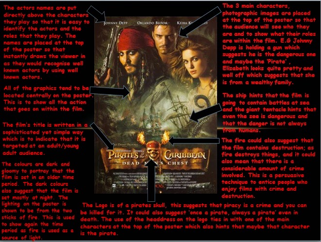
To help with understanding print based analysis and how to get the best answers, my teacher gave my class a homework task that was to choose a poster from a film you had seen, but not for at least 3 years, and analyse it, just like the James Bond comparison task ( see previous posts).
I decided to analysis the first 'Pirates of the Caribbean: The Curse of the Black Pearl' teaser poster. I chose this poster because I found there was a range of topics I could talk about. I also found that because it is one of my favourite films, that by doing the analysis on the poster it allowed me to understand the film a little bit better and to understand what the producers of the film wanted to audience to extract from the text.
From this, audience theory would come into it, however I have not been taught in detail about that yet, so I will add a different post all about audience theory in the near future :)
Below is a print screen of my poster analysis.
Hey bloggers,
To help with understanding print based analysis and how to get the best answers, my teacher gave my class a homework task that was to choose a poster from a film you had seen, but not for at least 3 years, and analyse it, just like the James Bond comparison task ( see previous posts).
I decided to analysis the first 'Pirates of the Caribbean: The Curse of the Black Pearl' teaser poster. I chose this poster because I found there was a range of topics I could talk about. I also found that because it is one of my favourite films, that by doing the analysis on the poster it allowed me to understand the film a little bit better and to understand what the producers of the film wanted to audience to extract from the text.
From this, audience theory would come into it, however I have not been taught in detail about that yet, so I will add a different post all about audience theory in the near future :)
Below is a print screen of my poster analysis.
Analysis help
Previosuly Unposted
Hi bloggers,
After submitting all of my text analysis such as the poster analysis and the written analysis (see previous posts), I decided to research the best way to analysis media texts and how to get the top marks within an exam.
Below are the two websites that I found the most useful:
1) http://www.ehow.com/how_4925370_analyze-film-trailer.html - This link does work and it gives you a step by step guide on how to analyse any media text print or moving image. Within each step it tells you what to comment on and how to go about it. :)
2) http://cw.routledge.com/textbooks/9780415448239/control.asp - Unfortunately this link does not work :( .. but you can type the link into your search engine and it should work :). This website outlines the exam and also gives you an example trailer to watch and analysis. It then gives you all the information that you could have written about and does it in sections so it doesn't confuse the reader. :)
Even though these websites did work, I do think that the best way to get good at textual analysis is to practice and get someone else to check over the work and give constructive criticism. By doing textual analysis , it also helps with your English language skills, through spelling, constructing sentences, punctuation and essay writing.
I hope the links help :)
Hi bloggers,
After submitting all of my text analysis such as the poster analysis and the written analysis (see previous posts), I decided to research the best way to analysis media texts and how to get the top marks within an exam.
Below are the two websites that I found the most useful:
1) http://www.ehow.com/how_4925370_analyze-film-trailer.html - This link does work and it gives you a step by step guide on how to analyse any media text print or moving image. Within each step it tells you what to comment on and how to go about it. :)
2) http://cw.routledge.com/textbooks/9780415448239/control.asp - Unfortunately this link does not work :( .. but you can type the link into your search engine and it should work :). This website outlines the exam and also gives you an example trailer to watch and analysis. It then gives you all the information that you could have written about and does it in sections so it doesn't confuse the reader. :)
Even though these websites did work, I do think that the best way to get good at textual analysis is to practice and get someone else to check over the work and give constructive criticism. By doing textual analysis , it also helps with your English language skills, through spelling, constructing sentences, punctuation and essay writing.
I hope the links help :)
Subscribe to:
Posts (Atom)