Previously Unposted
When looking at films and their genre, it an sometimes be difficult to decided exactly which genre category some films fit into.
As part of the Media Studies Course my teacher signed up to a site called media edusite which I believe ,was paid for as part of a package. My class and I were given individual log in details and passwords to access all of the content.
I found this site very useful in understanding genre and helping me to construct my DVD cover and Poster by looking at genre conventions and the examples that are given.
I would recommend this site as it give simple information with diagrams/images and written examples to back up the information. It also includes a range of different information that you may need and uses (and explains) proper media terminology.
I hope you ,my readers, find this link as helpful as I did :)
Below is a link to the one page that I used when deciding on a film idea and genre to place it in. The link does work if you click on it and takes you straight to the fantasy genre page.
http://media.edusites.co.uk/article/fantasy-genre-codes-conventions/
Please Note: The whole page may not show up because the link is not logged on. To view the whole page and the whole website, you would have to sign up :)
Another link that I found that helped me make my script the best it can be is stated below
http://screenwriting.4filmmaking.com/script-format1.html
To help me save time when creating my DVD cover I also decided to start to plan the written content , as I am writing the script, so I thought I would ' kill two birds with one stone' as they say. I used this website to give me an idea of how to right the blurb for my DVD cover.
http://www.ehow.com/how_8506705_write-dvd-cover-content.html
Monday, 8 September 2014

Monday, 1 September 2014
Exam Prep.... Another Theory
Previously Unposted
http://www.mediaknowall.com/as_alevel/alevkeyconcepts/alevelkeycon.php?pageID=audience
The link at the top of this post is a very well know website, that was given to me and my media class by my media teachers.
The link takes you straight to a media page that explains about the different types of audience theory , with diagrams to show how the theory works. It also explains where the theory came from and who came up with the theory.
There are other websites that give you the same information , however I found this website to be the best for me to learn from as it does have diagrams and all the information is condensed down onto just one page. From the website I have used this website to create my own revision spider diagrams.
I hope that you find this website as helpful as I did.
(unfortunately the link does not work, however if you type it into your search engine it will go to the correct page.)
http://www.mediaknowall.com/as_alevel/alevkeyconcepts/alevelkeycon.php?pageID=audience
The link at the top of this post is a very well know website, that was given to me and my media class by my media teachers.
The link takes you straight to a media page that explains about the different types of audience theory , with diagrams to show how the theory works. It also explains where the theory came from and who came up with the theory.
There are other websites that give you the same information , however I found this website to be the best for me to learn from as it does have diagrams and all the information is condensed down onto just one page. From the website I have used this website to create my own revision spider diagrams.
I hope that you find this website as helpful as I did.
(unfortunately the link does not work, however if you type it into your search engine it will go to the correct page.)
Sunday, 31 August 2014
Typography...Script...Typography...Script
Previously Unposted
As my media lessons have been split into focusing on coursework and my exam , these blog posts are starting to jump from one topic to another. I do apologise for this,as I am trying to update you (my audience) on what I am doing within each lesson.
This post is going to be short and sweet , as I am focusing all my attention this week on my coursework.
After deciding on a storyline for my coursework, I decided to push myself and aim to find a suitable font for my poster and DVD cover, whilst still writing up my script.
The deadline for the script (the pre-production) is closer than the deadline for the DVD Cover (post-production). However I thought that I would make things a little easier on myself by planning ahead and making sure I had all of the research I needed to create all of my coursework quickly and efficiently so that I would have time to make corrections if needed.
Taking a break from script writing, I decided to create a word document of all the fonts (Typography) that I could potentially use on my production pieces.After asking around my peers and both my media teachers I narrowed the options down to three . All 3 of these fonts I found on the website
www.dafont.com .
The reason I chose to use this site, is for the simple reason that the fonts are easy to download, there are a range of different designs to choose from , and you can even try out the font in the title that you want.
Below are the 3 fonts that I have to choose from for my production pieces. The links show my film title in the 3 fonts that I chose.
http://www.dafont.com/kiss-me-quick.font?text=Losing+Reality
http://www.dafont.com/from-me-2-you.font?text=Losing+Reality
http://www.dafont.com/alertse.font?text=Losing+Reality
As my media lessons have been split into focusing on coursework and my exam , these blog posts are starting to jump from one topic to another. I do apologise for this,as I am trying to update you (my audience) on what I am doing within each lesson.
This post is going to be short and sweet , as I am focusing all my attention this week on my coursework.
After deciding on a storyline for my coursework, I decided to push myself and aim to find a suitable font for my poster and DVD cover, whilst still writing up my script.
The deadline for the script (the pre-production) is closer than the deadline for the DVD Cover (post-production). However I thought that I would make things a little easier on myself by planning ahead and making sure I had all of the research I needed to create all of my coursework quickly and efficiently so that I would have time to make corrections if needed.
Taking a break from script writing, I decided to create a word document of all the fonts (Typography) that I could potentially use on my production pieces.After asking around my peers and both my media teachers I narrowed the options down to three . All 3 of these fonts I found on the website
www.dafont.com .
The reason I chose to use this site, is for the simple reason that the fonts are easy to download, there are a range of different designs to choose from , and you can even try out the font in the title that you want.
Below are the 3 fonts that I have to choose from for my production pieces. The links show my film title in the 3 fonts that I chose.
http://www.dafont.com/kiss-me-quick.font?text=Losing+Reality
http://www.dafont.com/from-me-2-you.font?text=Losing+Reality
http://www.dafont.com/alertse.font?text=Losing+Reality
Saturday, 30 August 2014
Exam Practice: Avatar Analysis
Previously Unposted
As a class we all watched the full film together, and our homework was to write up a detailed analysis of the official trailer( found on YouTube).
This is not the full essay that I wrote.. I have written out snippets of my answer from the start, main body and ending of the essay. In the original essay I included a lot more detail and print screen images from the trailer to back up my analysis. Originally the essay is around 19 paragraphs long , which typed is around 3 pages of A4 .
My teacher made up the title to help ease us into exam questions and answers. This was originally set as homework, but it was also used for individual revision purposes, setting us up for the exam.
Because I have only posted snippets of the essay , to show where there would be more paragraphs I have placed a long line of dots E.G. ............................................................................................................................................................................................................
As this is is not a previous post , I do welcome any comments on my work and I hope it helps you to understand analysis better, the film a little bit better , and even how to construct an essay.
So here it is folks .. the essay :)
Watch
the following trailer and analyse everything that you can see from the starting
credits to the ending credits, using media terminology.
The
trailer that I am going to be analysing is the Avatar Movie HD trailer. Within
this essay I am going to be analysing the trailer, commenting on the visual
codes, genre, characters and settings/Mis- En-Scene. I will also be analysing the Persuasive
techniques of the trailer, the music used and how the clips of the film are
structured together.
Even
before the film clips actually start the two company logos that are producing
the film are flashed on the screen. This is to show the audience who is
responsible for the making/producing of the film yet does not take up any of
the actual film trailer or the time.
................................................................................................................................................................................................................
The next
part of the trailer shows an army of soldiers, running down a ramp that is
connected to a gigantic spacecraft, and in the middle is the main character.
All of the soldiers are wearing gas masks which, again hints that they are not
on planet Earth. It also hints that this is the main characters mission. This
is a persuasive technique because the soldiers give a sense that there is going
to be a fight/battle/war within the film and this entices the action lovers out
there to watch it.
....................................................................................................................................................................................................................
The clip
below shows a giant piece of technological machinery, which is similar to a
bulldozer, crashing through a forest and knocking down all the trees and
foliage in its path. This conveys to the audience that there is a considerable
amount of destruction within the film Avatar.
......................................................................................................................................................................................................................
From about half way
through the trailer till the end there are short and snappy persuasive
techniques to make the audience want to watch the whole film. The very first
one that flashes across the screen is the directors name ‘James Cameron’. The
next 5 techniques are names of famous films that he has directed and nearly
everyone has heard off/ seen. This is a persuasive technique because if the
audience liked his other films it may make them want to watch Avatar. All of
the film titles are split up by different clips from avatar that are showing a
lot of action, destruction and violence. The backgrounds are black to make the
information stand out more and to make the font look more futuristic to tie in
with the genre of the film.
...............................................................................................................................................................
Overall the avatar film trailer is persuading the audience to
what the film throughout, from start to finish by using techniques such as the
colour schemes, lighting, and distinctive snapshots of the movie.
Friday, 29 August 2014
Extra Coursework Research
Previously Unposted
True Story Films
True Story Books
Codes and Conventions of True Movies/ Films.
Research
True Story Films
- Flowers In The Attic
- 8 Mile
- Born on the 4th July
- The Social Network
- JFK
- Saving Private Ryan
- To Catch A Killer
- The Blind Side
- The Lovely Bones
- Titanic
- Pearl Harbor
- Brace Heart
True Story Books
- Flowers In The Attic Series
- The Boy No-one Loved
- Against All Odds
- Exploited
- Shattered Dreams
Codes and Conventions of True Movies/ Films.
- · Drama/tragedy
- · Sometimes a happy ending
- · Based on real time events
- · Mostly starts from the past and pans out over the time of the event
- · Crying/Kissing/Hugging
- · Emotional/plays on the audiences emotions
- · Tend to have a long screen time.
- · Focus on the ‘victim’
- · Opens the audiences eyes to the bigger picture of what actually goes on in the world
- · Shows the audience a different perspective
Thursday, 28 August 2014
Courswork: DVD Analysis
Previously Posted on 11/3/13
As extra research I also analysed the film's DVD covers as well for comparison. These are shown below(From top to bottom)
1) The Blind Side
2) The Lovely Bones
3) Titanic
 |
| DVD Cover Analysis of The Blind Side |
 |
| DVD Cover Analysis of The Lovely Bones |
 |
| DVD Cover Analysis of Titanic |
Tuesday, 26 August 2014
Coursework: Poster Analysis
Previously Posted on 11/3/13
Below are the three posters that I analysed for my coursework research. The 3 posters are (From top to bottom)
Below are the three posters that I analysed for my coursework research. The 3 posters are (From top to bottom)
1) The Lovely Bones
2) The Blind Side
3) The Titanic
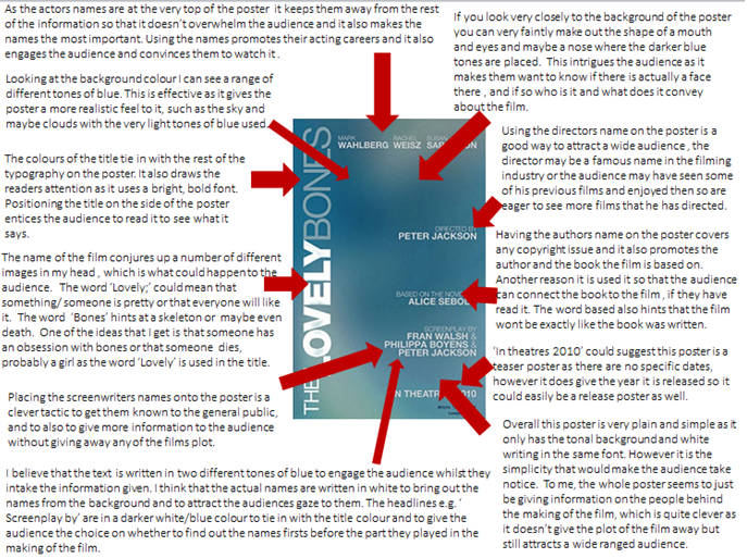 |
| The Lovely Bones Poster Analysis |
 |
| The Blind Side Poster Analysis |
 |
| Titanic Poster Analysis |
Subscribe to:
Posts (Atom)